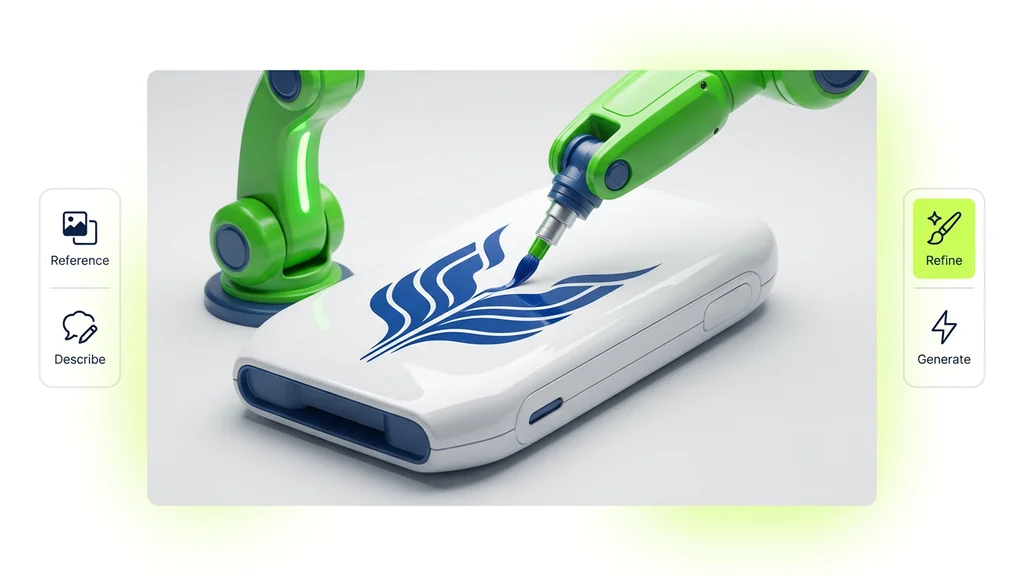
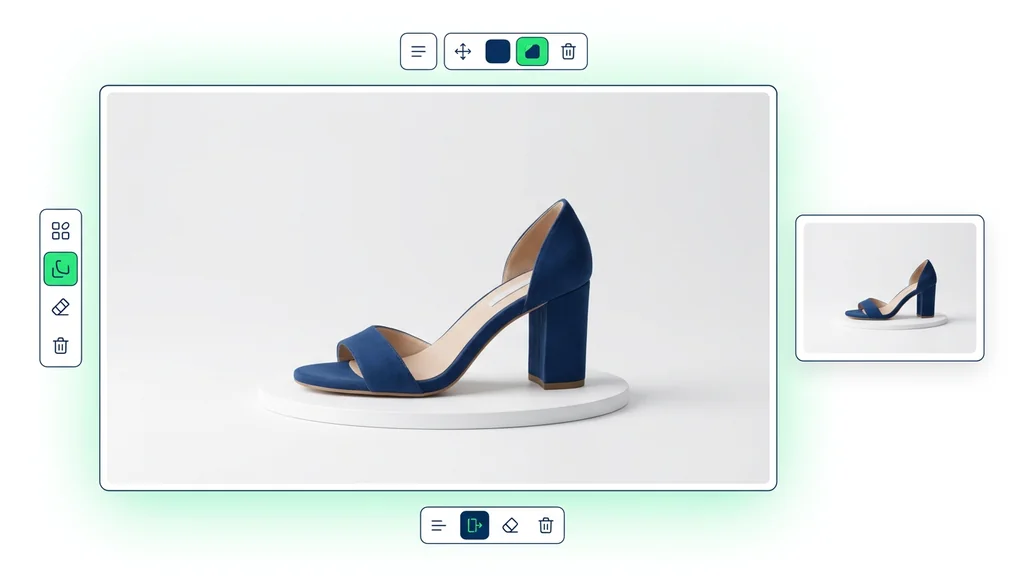
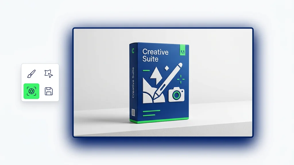
Ideogram is the page to open when the image has to communicate something, not just look interesting. Across its official docs and feature pages, the platform keeps emphasizing the same strengths: crystal-clear typography, strong prompt fidelity, style references, character consistency, Canvas, and local editing through Magic Fill. That combination makes Ideogram especially useful for posters, branded graphics, explainers, and social assets that need readable text and a deliberate layout.
This guide keeps the focus on practical use inside a broader Cleep workflow. It is here to answer a simple question: when should Ideogram be your first test, and when is it smarter to compare it with Seedream, Imagen 4 Ultra, or Kontext Pro? Instead of overpraising the model, this page tries to show what Ideogram is genuinely best at and how to prompt it without turning every job into design-flavored guesswork.
Use Ideogram first when the image needs readable text, poster-like structure, consistent style direction, or a fast path from concept to editable design asset.
The strongest official sources point to Ideogram 3.0 for photorealism, prompt fidelity, and typography; Style Reference for reusable aesthetics; Character Reference for one-image consistency; Magic Prompt for prompt expansion; and Canvas with Magic Fill and Extend for iteration. See the official docs, the Ideogram 3.0 feature page, and the developer documentation.
The fastest way to understand Ideogram is to stop comparing it to a pure art model. Ideogram is strongest where language and layout matter: logos, posters, social graphics, landing-page concepts, stickers, and promotional images with real text inside them. The official product story is unusually consistent here. Typography is not treated like a side feature. It is one of the platform's core reasons to exist.
That makes Ideogram a better first tab when the brief sounds like a designer talking: headline, hierarchy, caption, label, poster, card, packaging, sticker, or brand system. If the page needs readable copy plus image generation, Ideogram is often the more honest starting point than a model famous mostly for atmosphere.
Readable text in the image
One of the clearest reasons to use Ideogram when the asset needs titles, labels, slogans, or poster-style hierarchy.
Design-first outputs
Stronger fit for logos, covers, posters, packaging, social graphics, and print-ready sticker concepts than a generic art page.
Reusable style control
Style Reference lets you reuse aesthetics from saved styles or up to three uploaded references, which is useful for campaign consistency.
Iterative editing
Canvas, Magic Fill, Remix, Character Reference, and Extend make Ideogram more useful once the work moves past the first generation.
Ideogram becomes the obvious choice when the image is meant to carry copy, branding, or layout logic. That includes launch posters, event announcements, merch concepts, ad cards, book covers, app-store graphics, and social media templates. The official 3.0 page also leans into brand graphics and photoreal design work, so it is not limited to flat poster art.
There is another layer that matters for production: continuity. Style Reference, Character Reference, and Canvas workflows make Ideogram more than a one-shot generator. They give you a path to variation without losing the visual system.
Ideogram works best when you decide early which part of the job matters most: typography, style consistency, character continuity, or local editing. If you skip that choice, it is easy to mix too many controls at once and get a muddy result. A cleaner workflow is to choose the primary control first, then add the others only where they help.
For example, if the job is a branded poster, start with the structure and text hierarchy. If the job is a repeating mascot, start with Character Reference. If the job is a near-finished graphic that only needs one changed object or one corrected line, move into Canvas and use Magic Fill.
For Ideogram, the useful prompt is not "make it cool." The useful prompt is a compact art-direction brief. Start with the asset type, then the message, then the layout, then the visual tone, then the style or reference system, and finally any production constraints like aspect ratio or transparent background needs.
Magic Prompt can help when the base prompt is too thin, but it is not always the right move. Ideogram's own docs make clear that Magic Prompt expands and embellishes the text, which is great for exploration but not always ideal when you need strict control. If your design needs precise copy or continuity, start with a clearer original brief and keep Magic Prompt on a short leash.
Goal: fashion event poster.
Prompt: Create a fashion poster with a close-up photographic crop of magenta trousers, minimalist neutral background, the word "ZENITH" in a clean serif headline, smaller French event details below, balanced margins, elegant editorial spacing, vertical format.
Goal: summer camp logo.
Prompt: Design a playful logo for Pinecrest Pioneers Camp. Include a cabin, pine trees, a bright sun, and the camp name in bold warm lettering. Friendly but not childish, readable at sticker size, clean white background.
Goal: branded product card.
Prompt: Create a premium product card for a new fragrance launch. Dark green and light green palette, central bottle hero, elegant headline area, ingredient callouts in small but readable text, luxury beauty brand mood, 4:5 social format.
Goal: character-led social series.
Prompt: Using this character reference, create a set of three brand mascot cards for a fintech launch: welcome card, feature highlight, and referral announcement. Keep the face, hair, and accessories consistent, but vary the pose and background color per card.
Goal: sticker pack.
Prompt: Generate a sticker-style illustration pack for a museum-themed journal set with fossils, sculptures, and artifact labels. Strong white outlines, retro colors, high contrast, collage feel, separate readable captions where needed.
Ideogram becomes much stronger once you use the control surface around the generation model. Style Reference lets you build consistent aesthetics from saved styles or up to three reference images. Character Reference gives you a way to keep the same person or mascot recognisable from one image. Canvas is the workspace for iteration, not just the place where assets go to die after generation.
The docs also make a useful point about restraint. If you need to preserve composition or character identity, too much automatic prompt embellishment can work against you. In those situations, a clearer prompt plus Remix or Magic Fill often beats a more poetic prompt.
| Feature | Best use | Practical tip |
|---|---|---|
| Style Reference | Keeping a campaign or visual family cohesive. | Upload up to three style references or reuse a saved Style Code once you find a look that works. |
| Character Reference | Maintaining the same face, hair, and key traits across scenes. | Use a clear portrait-style image and adjust the mask if hair or accessories should change. |
| Magic Prompt | Exploring richer ideas from a short prompt. | Good for discovery, but reduce or disable it when copy, layout, or continuity must stay strict. |
| Canvas and Magic Fill | Editing a part of the design without rebuilding the whole thing. | Mask only what should change and keep enough surrounding context inside the generation window. |
| Batch Generation | Scaling many related prompts at once. | Prepare prompt spreadsheets for repeated asset families instead of treating every output as a one-off job. |
The useful rule is simple. If the image needs typography, layout, and design hierarchy, Ideogram deserves first look. If the task shifts toward reasoning-heavy explainers, pure photoreal polish, or surgical image editing, another model may be the better lead.
Start with Ideogram
when the output is a poster, logo, sticker, social card, ad graphic, or brand visual where readable text is part of the image.
Compare with Seedream 4
when you want a stronger generation-plus-editing page and the work is less typography-led.
Compare with Seedream 5
when the brief includes reasoning, current information, structured explainers, or knowledge-driven visuals.
Compare with Imagen 4 Ultra
when commercial photorealism matters more than typography and layout control.
Compare with Kontext Pro
when the main job is precise editing of an existing image instead of building a design-led asset from scratch.
Use the image model hub
when you want to place Ideogram inside the wider Cleep stack before choosing one model family.
Design-first images can fail in small ways that kill their usefulness. Before export, review the piece at the actual size where it will live. A poster that looks clean full-screen can collapse in a feed. A logo concept that feels clever can break once the text shrinks. Ideogram is strong, but readability still has to be checked like a human would check it.
This page is grounded in official Ideogram sources: the product documentation, the Ideogram 3.0 feature page, the Style Reference docs, the Character Reference docs, the Magic Prompt docs, the Magic Fill docs, and the API documentation. I intentionally left out unsupported revenue, engagement, and team-productivity claims that often turn these pages into generic AI copy.
Ideogram is best known for strong text rendering inside generated images, which makes it especially useful for posters, logos, marketing visuals, and other layout-aware assets.
The official feature pages and developer docs currently center Ideogram 3.0, which is presented as a model with stronger photorealism, prompt fidelity, and typography.
Use it when the base prompt is thin and you want more visual richness or variation. Use it carefully when the text, structure, or brand system needs strict control.
It helps you keep a cohesive aesthetic by using saved styles or up to three reference images as the style anchor for new generations.
It helps preserve a recognisable character from one reference image so facial features, hair, and key traits stay consistent across new scenes.
Yes. In Ideogram's official workflow, Magic Fill lets you mask an area and modify it while keeping the rest of the image intact.
Compare with Seedream 5 for reasoning-heavy explainers, Imagen 4 Ultra for polished photorealism, or Kontext Pro for more surgical editing of an existing image.