Loading library...
Super Promotion
Create stunning AI photos & videos with essential tools
Unlock the Basic Plan for just $1
Auto-renewal is active. Cancel anytime. 90% off applies to the first billing cycle.
By choosing your age and continuing you agree to our Terms of Use and Privacy Policy
Please review before continuing
Krea AI Image Generator
When people search for Krea, they usually are not looking for the most literal image model on the internet. They are looking for a generator that feels stylish quickly, gives them a more polished photographic mood than generic AI slop, and lets them explore a direction without getting trapped in a slow one-image-at-a-time workflow. Krea's own Image generation documentation supports that reading. The image tool is positioned as Krea's core creation surface, and the model Krea explicitly tells users to start with is Krea 1, its in-house frontier model built for stylish, photographic images that avoid a generic AI look.
That matters because this page should not pretend Krea is the best answer for every image task. In Krea's own docs, Krea 1 is strongest when you want artistic photorealism, editorial mood, fast exploration, style references, and LoRA-driven consistency. The same docs also say to avoid it when your job demands very precise structure, exact anatomy, or highly literal technical output. That is an honest and useful positioning, and it is much stronger than a vague promise about making beautiful AI images.
The cleanest way to think about Krea on Cleep is this: use it when the first image should already feel tastefully art-directed, and when you want to keep moving after that first hit. Krea's workflow is built around prompt-based generation, style references, fast batches, and an easy handoff into Edit, Enhance, or Video. If your team cares about momentum as much as raw image fidelity, that combination is the real reason to open this page.
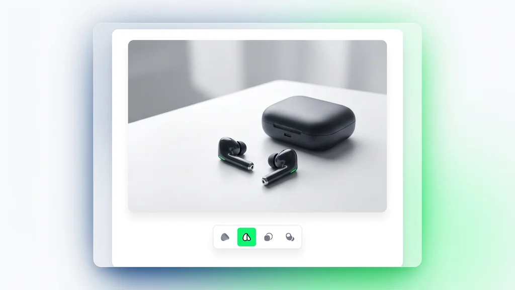
Use Krea first when the job is stylish photorealism, fashion-editorial mood, product or campaign ideation, and fast creative iteration that still feels visually intentional instead of obviously synthetic.
The main primary sources behind this guide are Krea's official Image generation guide, the official Krea 1 model page, the official Realtime guide, the official Model Overview, and the current Krea pricing page.
What Krea is actually best at
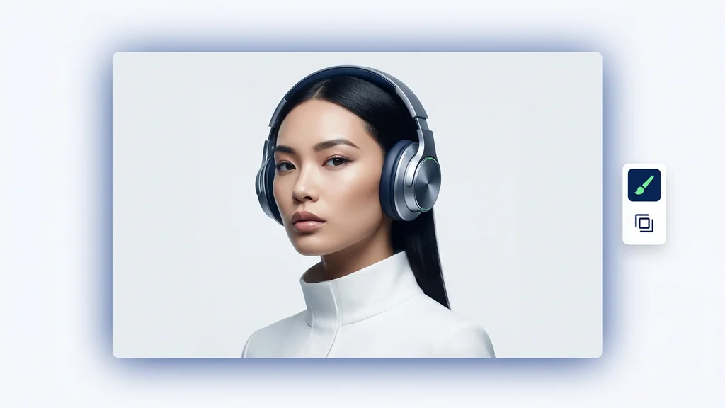
Krea is strongest when you want the model to make a point of view for you, not just obey a sterile specification. The official Krea 1 page says the model was built to avoid soft textures, blown-out contrast, and the sameness that makes so many AI images feel obviously artificial. That is a very specific promise, and it points to the use cases where Krea tends to feel worth opening first: editorial portraits, fashion and beauty concepts, product scenes with atmosphere, architecture that needs a mood rather than just a diagram, and polished marketing visuals that should feel intentional right away.
It also helps that the official workflow is fast. Krea 1 returns up to four variations in around six seconds, supports style references, and lets you keep iterating inside one session instead of forcing you to restart from scratch every time. That makes it especially good for client review loops, mood exploration, campaign branching, and early-stage art direction where the real deliverable is not one final image yet. It is a strong answer to the question, "What direction should we push?"
Stylish photorealism is the core promise
Krea's own docs describe Krea 1 as a flagship image model built to avoid generic AI aesthetics and produce crisp textures with realistic detail.
Fast batches help real review loops
The official Krea 1 page says it returns up to four images in around six seconds, which is fast enough for actual creative iteration instead of passive waiting.
Style references are not a side feature
Krea 1 supports a dedicated style reference system with up to three references and a style-weight slider, which makes it easier to direct taste, not just subject matter.
It is more creative than literal
The official prompting tips say to lean into mood and atmosphere rather than rigid technical specs, which is a very useful warning if you expect exact engineering-style output.
Krea Image and Krea Realtime are different kinds of speed
A lot of users mix these together, but Krea's own docs separate them very clearly. Krea Image is the better starting point for deliberate, prompt-driven generation. Krea Realtime is the better starting point when you want to draw, move shapes, use screen share or webcam input, and feel your way toward an image or video with immediate visual feedback on the canvas.
That distinction is incredibly practical. If you already know the subject, mood, lighting, and style you want, Krea Image is cleaner. If you are still sketching composition, testing shapes and colors, or reacting live to external input, Realtime is more natural. The real strength of the Krea ecosystem is not that one tool replaces the other. It is that you can start with the kind of speed your project actually needs.
| Route inside Krea | Official positioning | Best use |
|---|---|---|
| Krea Image | Core prompt-based image generation tool with multiple models, style controls, image prompts, and post-generation handoffs | When you want a deliberate still image from text and references, with a cleaner path to editing, upscaling, or reuse. |
| Krea Realtime | Live image and video generation while you draw, type, move elements, or feed webcam and screen inputs | When ideation should feel interactive, rough, and immediate rather than fully specified before generation. |
| Krea 1 inside Image mode | Krea's flagship model for stylish, photographic images that avoid a generic AI look | When you want artistic photorealism, editorial direction, style-reference workflows, and fast high-quality option sets. |
What the official docs confirm
The old version of this page tried to act like a broad company review. That made it long, but not trustworthy. The official Krea docs are already enough to build a much better user-facing page, as long as we stay close to what they actually confirm.
| Area | Officially confirmed | What that means for the user |
|---|---|---|
| Where to start | The Image generation docs say the default selection is Auto, but recommend Krea 1 as a good place to start if you want to choose yourself. | Krea 1 is the clearest reference point for understanding what users usually mean when they say they want "the Krea look." |
| Core visual positioning | The Krea 1 page describes the model as built to avoid generic AI aesthetics, with crisp textures, realistic detail, and flexible artistic range. | This is a style-first model page, not a promise of the most literal or technical output. |
| Generation behavior | Krea 1 generates up to 4 images in around 6 seconds and supports native 1.5K output, with upscaling to 4K through Enhancer. | It is strong for fast branching and then polishing the winner, instead of slowly hunting for one perfect initial render. |
| Style control | Krea 1 supports LoRAs and a dedicated style reference system with up to 3 reference images and a style-weight slider. | You can direct the visual taste much more precisely than with text alone, especially when you need brand or campaign consistency. |
| Supported aspect ratios | The official Krea 1 page lists 4:3, 3:2, 16:9, 2.35:1, 1:1, 4:5, 2:3, and 9:16. | That covers most brand, social, presentation, editorial, and widescreen concept needs without awkward workarounds. |
| When to avoid Krea 1 | The official Use When / Avoid When section says to avoid it for exact anatomical accuracy, purely photographic realism with no artistic interpretation, and highly literal technical output. | Krea is not the page to trust blindly when the brief is rigid, diagrammatic, or unforgivingly precise. |
| Model choice guidance | Krea's model docs recommend Nano Banana Pro for complex prompt adherence, Seedream 5 Lite for high-fidelity text, and Ideogram for graphic design and flat illustration. | Krea itself tells users when another model is the better fit, which is a healthy sign and useful for page-level comparisons. |
| Plan structure | As of April 19, 2026, Krea's pricing page lists a Free plan with 100 compute units per day, while paid plans add commercial license and broader model access. | It is realistic to test Krea's look before paying, but commercial use and fuller workflow access sit on paid tiers. |
How to prompt Krea without getting the generic AI look it was built to avoid
Krea's own prompting tips are refreshingly practical. The docs do not tell you to write a novel. They tell you to be specific about lighting, composition, and style; to use photography or art-direction language such as shallow depth of field, golden hour, or shot on 35mm; and to combine mood with concrete visual details. They also make an important point: Krea 1 is more creative than literal. If you push it with rigid technical instructions only, you are using the model against its own strengths.
The other major advantage is style reference. Krea 1's style-reference system exists because words are often a weak way to describe taste. If you already know the aesthetic family you want, adding one to three references and adjusting the style weight is often more useful than making the prompt longer. Krea becomes much stronger when you use it like an art-direction tool, not a brute-force command line.
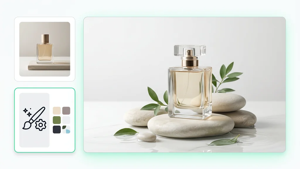
Use it for product photography: ask for material, light, surface, and brand mood, not just the object name.
Prompt: Matte glass skincare bottle on pale stone, soft side light, shallow depth of field, premium beauty campaign mood, clean luxury styling, realistic textures, editorial composition.
Use it for fashion-editorial portraits: let the model interpret mood, wardrobe, and light together.
Prompt: Editorial portrait of a woman in a structured black coat, overcast city dusk, muted palette, soft wind, shot on 35mm, premium magazine feeling, cinematic but realistic.
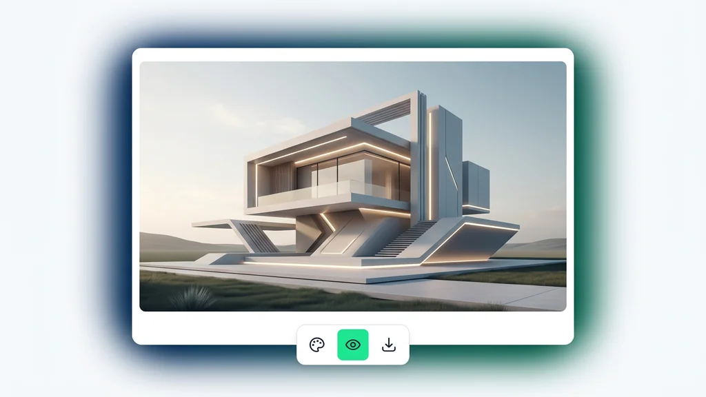
Use it for architecture or interiors: describe material, lighting direction, and atmosphere rather than only the floor plan.
Prompt: Minimal coastal living room with travertine, brushed oak, warm late-afternoon light, calm luxury tone, realistic texture detail, wide interior editorial framing.
Use it for reference-led generation: upload one style image for taste, a second for color palette, and keep the text prompt focused on subject and scene.
Workflow idea: Use the style references to carry the aesthetic load, then keep the written brief short, clear, and visual instead of endlessly descriptive.
Where Krea feels strongest in real work
Krea's own Krea 1 page already names the use cases where the model naturally fits: product photography, concept art, architectural visualization, fashion and beauty, and stock-style commercial imagery. Those are not random examples. They all share the same underlying need: the image should feel art-directed and usable early, even before a team moves it into a more specialized finishing tool.
That makes Krea especially useful in the middle of a creative pipeline. It is a strong way to generate a moodboard hero, a visual territory for a campaign, a premium-looking product scene, or a direction for a client deck. Then, once one version clearly wins, the official workflow lets you send that image straight into Edit, Enhancer, or Video.
| Use case | Why Krea fits | What to specify |
|---|---|---|
| Product photography | Krea handles material finish, light, surface, and brand mood well when the brief is visual and taste-led. | Product material, label feel, surface, light direction, reflection quality, and brand world. |
| Fashion and beauty | The model's editorial bias helps when the job is campaign mood rather than clinical realism. | Wardrobe silhouette, lens feel, light quality, palette, and magazine or campaign tone. |
| Concept art | Fast four-image batches make it easy to branch different directions without losing tempo. | Environment, mood, light source, texture language, and camera framing. |
| Architecture and interiors | Krea is useful when you need a convincing atmosphere, materials, and spatial feeling early in the process. | Materials, time of day, window light, styling density, and camera angle. |
| Commercial stock-style imagery | It is fast enough to explore multiple commercially plausible directions before you commit to one. | Audience, placement, crop, copy space, and whether the image should feel clean, premium, warm, or energetic. |
What to do after the first good image
Krea's post-generation workflow is one of the reasons this page has practical value. The official Image generation docs say each prompt produces a row of results, and from there you can retry, reuse parameters, share parameters, download all, publish, or jump directly into Edit, Upscale and Enhance, or Video. That means Krea is not just good at first ideas. It is also good at keeping creative continuity after the first idea appears.
This is where Krea feels more like a creative operating surface than a single model. You generate in Krea 1, keep the parameters that worked, then move the winner forward. That is a better workflow than exporting one image and forgetting how you got it. For teams, it also makes approval and reproduction much easier because the settings can be reused or shared, not guessed from memory.
- Generate small batches first: Krea 1 is fast enough that it usually makes sense to branch a few directions before polishing anything.
- Save the winning setup, not just the image: reuse parameters or share parameters so the direction stays reproducible.
- Use Enhancer for the frame that already works: upscale after the composition is right, not before.
- Use Edit when the image is close but not finished: Krea's own interface is built around that handoff.
- Use Video when the still image clearly carries the right world: one good Krea frame can become the start of a motion workflow instead of a dead end.
When to compare another model instead
A good Krea page should also tell you when not to use Krea. The official Krea model docs already do some of that work for us. If the task is more about exact prompt adherence, high-fidelity text, or flat graphic design, Krea itself points users toward other models. That makes this comparison section more trustworthy, not less.
Stay with Krea
when the image should feel stylish, premium, and art-directed early, and when style references or LoRAs are part of the workflow.
Compare with Nano Banana Pro
when the prompt is complex and exact adherence matters more than Krea's creative looseness.
Compare with Seedream 5
when text inside images is the job, not a minor detail. Krea's own docs point to Seedream 5 Lite for high-fidelity text.
Compare with Ideogram
when the work is graphic design, flat illustration, layouts, and lettering-forward visuals instead of editorial photorealism.
Compare with Qwen
when human realism, natural detail, and stronger text rendering matter more than the Krea house aesthetic.
Use the image model hub
when you are still deciding whether your job is style-first, reasoning-first, typography-first, or budget-first.
What we verified for this guide
This rewrite is grounded in Krea's current official documentation, not third-party summaries. The main references are the official Image generation guide, the official Krea 1 page, the official Realtime page, the official Model Overview, and the live pricing page. I removed unsupported claims about company history, mobile behavior, latency benchmarks, funding, offline support, custom training specifics, and competitor rankings that were not necessary or not cleanly supported by those sources.
Frequently Asked Questions About Krea AI
What is Krea AI best for?
Krea is strongest when you want stylish, non-generic images quickly, especially for product scenes, editorial portraits, fashion and beauty visuals, concept art, and architecture or interiors with a clear mood.
What is Krea 1?
According to Krea's official docs, Krea 1 is its flagship image model built to avoid generic AI aesthetics and deliver crisp textures, realistic detail, and flexible artistic range.
Is Krea good for photorealistic images?
Yes, but in a tasteful, art-directed way. Krea's own positioning is closer to artistic photorealism and editorial polish than to rigidly literal technical rendering.
When should I use Krea Realtime instead of Krea Image?
Use Realtime when you want to draw, move shapes, use webcam or screen input, and explore visually without waiting for a render button. Use Krea Image when your prompt and references are already clearer and you want a more deliberate still-image workflow.
How fast is Krea 1?
The official Krea 1 page says it returns up to four images in around six seconds, which makes it well suited to rapid review loops and direction finding.
Can Krea use style references?
Yes. Krea 1 includes a dedicated style-reference system and supports up to three reference images, plus a style-weight slider that controls how strongly those references shape the result.
Can I use Krea for free?
As of April 19, 2026, Krea's pricing page lists a Free plan with 100 compute units per day. That is enough to test the workflow and visual direction before moving to a paid tier.
Do paid plans include commercial rights?
Yes. The current pricing page says commercial license is included from the Basic plan upward.
What is Krea not the best fit for?
Krea's own docs say to avoid Krea 1 when you need very precise structured compositions, exact anatomical accuracy, or purely literal technical output with minimal artistic interpretation.
Which model should I compare if text quality matters most?
Krea's official model guidance points users toward Seedream 5 Lite for high-fidelity text in images, so that is the cleanest comparison path when lettering is central to the brief.